Representations of Networks
Contents
3.3. Representations of Networks#
Now that you know how to represent networks with matrices and have some ideas of properties of networks, let’s take a step back and take a look at what network representation is in general, and the different ways you might think about representing networks to understand different aspects of the network.
We already know that the topological structure of networks is just a collection of nodes, with pairs of nodes potentially linked together by edges. Mathematically, this means that a network is defined by two objects: the set of nodes, and the set of edges, with each edge just being defined as a pair of nodes for undirected networks. Networks can have additional structure: you might have extra information about each node (“features” or “covariates”), which we’ll talk about when we cover Joint Representation Learning in Section 5.5. Edges might also have weights, which are usually measure the connection strength in some way. We learned in the previous section that network topology can be represented with matrices in a number of ways – with adjacency matrices, Laplacians, or (less commonly) with incidence matrices.
One major challenge in working with networks is that a lot of standard mathematical operations and metrics remain undefined. What does it mean to add a network to another network, for instance? How would network multiplication work? How do you divide a network by the number 6? Without these kinds of basic operations and metrics, you are left in the dark when you try to find analogies to non-network data analysis.
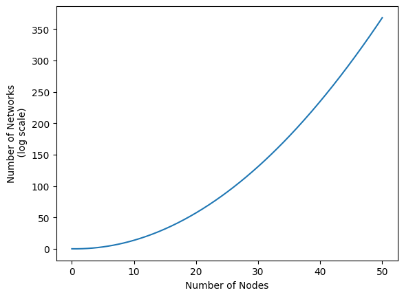
Another major challenge is that the number of possible networks can get obscene fairly quickly. See the figure below, for instance. When you allow for only 50 nodes, there are already more than \(10^{350}\) possible networks. Just for reference, if you took all hundred-thousand quadrillion vigintillion atoms in the universe, and then made a new entire universe for each of those atoms… you’d still be nowhere near \(10^{350}\) atoms.
import matplotlib.pyplot as plt
from scipy.special import comb
from contextlib import suppress
from scipy.interpolate import interp1d
import numpy as np

# get number of graphs for a given n in log scale
vertices = np.arange(51, step=10)

with suppress(OverflowError):
    n_graphs = np.log10(2**comb(vertices, 2))
n_graphs[-1] = 368

xnew = np.linspace(vertices.min(), vertices.max(), 300)
interpolated = interp1d(vertices, n_graphs, kind="cubic")
ynew = interpolated(xnew)

# plotting code
fig, ax = plt.subplots()
ax.plot(xnew, ynew)
ax.set_xlabel("Number of Nodes")
ax.set_ylabel("Number of Networks\n (log scale)");
/tmp/ipykernel_6749/3329702103.py:11: RuntimeWarning: overflow encountered in power
  n_graphs = np.log10(2**comb(vertices, 2))
To address these challenges, you can generally group analysis into four approaches, each of which addresses these challenges in some way: the bag of features, the bag of edges, the bag of nodes, and the bag of networks, each so-called because you’re essentially throwing data into a bag and treating each thing in it as its own object. Let’s get into some details!
3.3.1. Bag of Features#
The first approach is called the bag of features. The idea is that you take networks and you compute statistics from them, either for each node or for the entire network. These statistics could be simple things like the edge count or average path length between two nodes like you learned about in the last section, or more complicated metrics like the modularity [1], which measures how well a network can be separated into communities. Unfortunately, network statistics like these tend to be correlated; the value of one network statistic will almost always influence the other. This means that it can be difficult to interpret analysis that works by comparing network statistics. It’s also hard to figure out which statistics to compute, since there are an infinite number of them.
3.3.1.1. You Lose A Lot of Information with the Bag of Features Approach#
Let’s take a look at a collection of networks in Fig. 3.2:
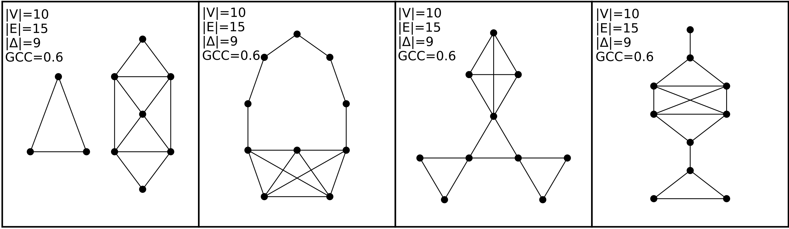
Fig. 3.2 This figure contains four networks, all of whom have the exact same network statistics for the four statistics we show here. They each have ten nodes and 15 edges. They also all contain the same number of closed triangles, and the same [global clustering coefficient from Section 3.2.3.2.#
Each of these networks, however, are completely different from each other. The first network, for instance, has two connected components, while the others are all connected. The second network has a community of nodes that are only connected along a path, and a different community which are tightly connected – and so on. Modeling these networks through computing these features from them would lose a great deal of useful information about the topology of the network.
3.3.1.1.1. Network Features Tend to be Correlated#
As we mentioned in the last paragraph, if you consider all possible networks, knowing the value of any of the network features gives you information about what the value of other network features might be.
Let’s play around with this. We’ll make 100 random networks, each with 50 nodes, and then we’ll compute some of the most common network statistics that people will use on them (you’ll explain what each network feature is along the way). Then, you’ll look at how correlated these features are. For now, just think of a random network as being a network with each node being connected to each other node with some set probability. Each network will have a different connection probability. These networks will also have communities – groups of nodes which are more connected with each other than other nodes – the strength of which will also be determined randomly. When you generate data later on in this book, you’ll get into different types of random network models you can use.
from graspologic.simulations import sbm
import numpy as np
from numpy.random import uniform

n_nodes = 50
n_networks = 100
np.random.seed(1234)
p = uniform(size=100, low=.5).round(2)
q = uniform(size=100, high=.5).round(2)

networks = []
for i in range(n_networks):
    np.random.seed(1234)
    P = np.array([[p[i], q[i]],
                  [q[i], p[i]]])
    network = sbm(n=[n_nodes//2, n_nodes//2], p=P)
    networks.append(network)
Now, for each of these networks, you’ll calculate a set of network features, using some of the various properties you learned about in the previous Section 3.2.
The Modularity measures the fraction of edges in your network that belong to the same estimated community, subtracting out the probability of an edge existing at random. It effectively measures how much better a particular assignment of community labels is at defining communities than a completely random assignment.
The Network Density is the fraction of all possible edges that a network can have which actually exist. If every node were connected to every other node, the network density would be 1; and if no node is connected to anything, the network density would be 0.
The Clustering Coefficient indicates how much nodes tend to cluster together. If you pick out three nodes, and two of them are connected, a high clustering coefficient would mean that the third is probably connected as well.
The Path Length indicates how far apart two nodes in your network are on average. If two nodes are directly connected, their path length is one. If two nodes are connected through an intermediate node, their path length is two.
The code below defines functions to calculate each of these network features, and then calculates them for each of the networks you created above. Since most of these metrics already exist in networkx, we’ll just pull from there. You can check the networkx documentation for details.
We’ll also define a preprocessing decorator, which just converts the network from a numpy array into the format networkx uses.
import functools
import networkx as nx

def preprocess(f):
    @functools.wraps(f)
    def wrapper(network):
        network = nx.from_numpy_matrix(network)
        return f(network)
    return wrapper

@preprocess
def modularity(network):
    communities = nx.algorithms.community.greedy_modularity_communities(network)
    Q = nx.algorithms.community.quality.modularity(network, communities)
    return Q

@preprocess
def network_density(network):
    return nx.density(network)

@preprocess
def clustering_coefficient(network):
    return nx.transitivity(network)

@preprocess
def path_length(network):
    if nx.number_connected_components(network) != 1:
        # You want to make sure this still works if your network isn't fully connected!
        network = max((network.subgraph(c) for c in nx.connected_components(network)),
                      key=len)
    return nx.average_shortest_path_length(network)
Now, we’ll calculate all of these features for each network, and finally we’ll create a heatmap of their correlation.
import pandas as pd

network_features = []
for i, network in enumerate(networks):
    modularity_ = modularity(network)
    network_density_ = network_density(network)
    clustering_coefficient_ = clustering_coefficient(network)
    path_length_ = path_length(network)
    features = {"Modularity": modularity_, "Network Density": network_density_,
                "Clustering Coefficient": clustering_coefficient_, "Average Path Length": path_length_}
    network_features.append(features)

df = pd.DataFrame(network_features)
feature_correlation = df.corr()
Below is the heatmap. Numbers close to 1 mean that when the first feature is large, the second tends to be large, numbers close to 0 mean that the features are not very correlated, and numbers close to -1 mean that when the first feature is large, the second feature tends to be small.
import seaborn as sns
from graphbook_code import cmaps

plot = sns.heatmap(feature_correlation, annot=True, square=True,
                   cmap=cmaps["divergent"], cbar_kws={"aspect": 10, "ticks": [-1., -.5, 0., 0.5, 1.]})
plot.set_title("Average Correlation \nFor Your Network Features", y=1.05);
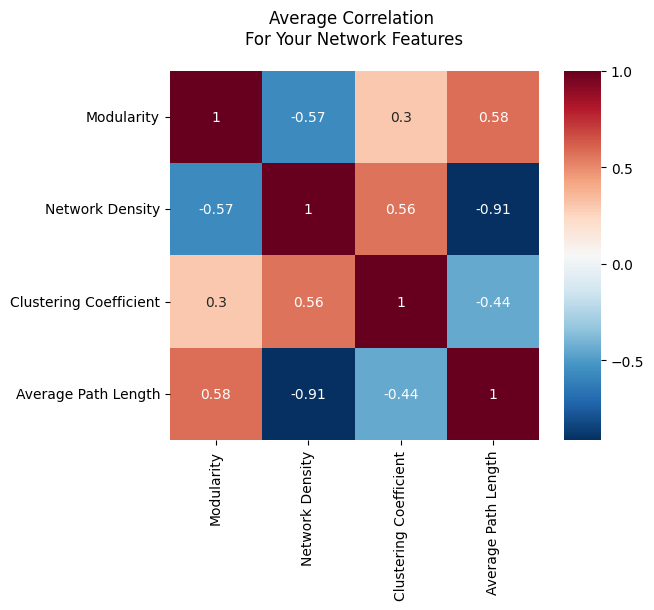
If you’re familiar with correlation, that these numbers aren’t particularly close to zero means that many of the features contain varying degrees of information about other features. Some of these features being big might say that another feature tends to also be high (positive correlation). Some of these features being big might say that another feature might tend to be the small (negative correlation). Some of these features don’t tell you much about another particular feature (for instance, clustering and modularity only have a correlation with a magnitude around \(0.3\)), and some features are nearly perfectly informative about other features (network density and average path length are nearly perfectly negative-correlated with a value of \(-.91\); that is, a high average path length implies a low network density, and vice versa).
3.3.2. Bag of Edges#
The second approach to studying networks is called the bag of edges. Here, you just take all of the edges in your network and treat them all as independent entities. You study each edge individually, ignoring any interactions between edges. This can work in some situations, but you still run into dependence: if two people within a friend group are friends, that can change the dynamic of the friend group and so change the chance that a different set of two people within the group are friends.
More specifically, in the bag of edges approach, you generally assume that every edge in your network will exist with some particular probability, which can be different depending on the edge that you’re looking at. For example, there might be a 60% chance that the first and second nodes in your network are connected, but only a 20% chance that the third and fourth nodes are. What often will happen here is that you have multiple networks describing the same (or similar) systems. For example, let’s use the mouse example again from above. You have your batman mice (who were raised in the dark) and your normal mice. You’ll have a network for each batman mouse and a network for each normal mouse, and you assume that, even though there’s a bit of variation in what you actually see, the probability of an edge existing between the same two nodes is the same for all batman mice. Your goal would be to figure out which edges have a different probability of existing with the batman mice compared to the normal mice.
Let’s make some example networks to explore this. We’ll have two groups of networks, and all of the networks will have only three nodes for simplicity’s sake. Each group will contain 20 networks, for a total of 40 networks. In the first group, every edge between every pair of nodes simply has a 50% chance of existing. In the second group, the edge between nodes 0 and 1 will instead have a 90% chance of existing, but every other edge will still just be 50%. We’ll generate ten networks from the first group, and ten networks from the second group.
from graspologic.simulations import sample_edges

P1 = np.array([[.5, .5, .5],
               [.5, .5, .5],
               [.5, .5, .5]])

P2 = np.array([[.5, .9, .5],
               [.9, .5, .5],
               [.5, .5, .5]])

# First group
n_networks = 20
networks = np.empty((2*n_networks, 3, 3))
for i in range(n_networks):
    networks[i,:,:] = sample_edges(P1)

# Second group
for i in range(n_networks, 2*n_networks):
    networks[i,:,:] = sample_edges(P2)

ys = np.array([1 for i in range(0, n_networks)] + [2 for i in range(0, n_networks)])
3.3.2.1. Figuring out which edge is the signal edge#
By design, you know that the edge between nodes 0 and 1 has signal - the probability that it’s there changes depending on whether your network is in the first or the second group. One common goal when using the bag of edges approach is finding signal edges: edges whose probability of existing changes depending on which type of network you’re looking at. In your case, we’re trying to figure out (without using your prior knowledge) that the edge between nodes 0 and 1 is a signal edge.
To find the outlier edge, you’ll first get the set of all edges, along with their indices. Since all of your networks are undirected, you’ll get the edges and their indices by finding all of the values in the the upper-triangular portion of the adjacency matrices.
edge_indices = np.triu_indices(3, k=1)
Now, you’ll use a hypothesis test called the Fisher’s Exact Test to find the outlier edge. You don’t need to worry too much about what fisher’s exact test is; it’s essentially a hypothesis that is useful with networks, which makes limited assumptions about your data. We’ll talk more about it in Section 8.2.
In the code below, we:
Loop through the edge indices
Get a list of all instances of that edge in the first group, and all instances of that edge in the second group
Feed that list into the Fisher’s exact test and obtain \(p\)-values (small \(p\)-value = more signal)
from scipy.stats import fisher_exact

edge_pvals = []
for i, j in zip(*edge_indices):
    gr1_edge = networks[ys == 1,i,j].sum()  # count the number of group1 with edge i,j
    gr2_edge = networks[ys == 2,i,j].sum()  # count the number of group2 with edge i,j
    gr1_noedge = n_networks - gr1_edge  # count the number of group1 without edge i,j
    gr2_noedge = n_networks - gr2_edge  # count the number of group2 without edge i,j

    edge_tab = np.array([[gr1_edge, gr2_edge], [gr1_noedge, gr2_noedge]])  # arrange as in table

    edge_pvals.append(fisher_exact(edge_tab).pvalue)
You can see below that the p-value for the first edge, the one that connects nodes 0 and 1, is extremely small, whereas the p-values for the other two edges are relatively large.
np.array(edge_pvals).round(3)
array([0.003, 1. , 0.333])
3.3.2.1.1. Correcting for Multiple Comparisons#
Because you are doing multiple tests, we’re running into a multiple comparisons problem here. If you’re not familiar with the idea of multiple comparisons in statistics, it is as follows. Suppose you have a test that estimates the probability of making a discovery (or, to be more rigorous, tells you whether you should reject the idea that you didn’t make a discovery). You run that test multiple times. If you run this test enough times, even if there’s no discovery to be made, eventually random chance will make it seem like you’ve made a discovery. So, the chance that you make a false discovery increases with the number of tests that you run. For example, say your test has a 5% false-positive rate, and you run this test 100 times. On average, there will be 5 false positives. If there was only one true positive in all of your data, and your test finds it, then you’d on average end up with 6 positives total, 5 of which were false.
We need to correct for this here because we’re doing a new test for each edge. There are a few standard ways to do this, but we’ll use something called the Holm-Bonferroni correction [2]. Don’t worry about the details of this; all you need to know for now is that it corrects for the multiple comparisons problem by being a bit more conservative with what you classify as a positive result. This correction is implemented in the statsmodels library, a popular library for statistical tests and data exploration.
from statsmodels.stats.multitest import multipletests

reject, corrected_pvals, *_ = multipletests(edge_pvals, method="holm", alpha=0.05)
You can see below that the corrected p-value for the edge connecting nodes 0 and 1 is still extremely small. In statistics, we somewhat arbitrarily choose a cutoff \(p\)-value (called the \(\alpha\) of the test) for determining when we have enough evidence to determine that there we have evidence against the idea that there is no difference between the two groups, so we’ll call edges with a \(p\)-value below \(\alpha = 0.05\) our signal edges. We’ve used the bag-of-edges approach to find an edge whose probability of existing changed depending on which group a network belongs to!
corrected_pvals.round(3)
array([0.01 , 1. , 0.666])
3.3.3. Bag of Nodes#
Similarly to the bag of edges, you can treat all of the nodes as their own entity and do analysis on a bag of nodes. Much of this book will focus on the bag of nodes approach, because we’ll often use edge count, covariate information, and other things when we work with bags of nodes – and, although there’s still dependence between nodes, it generally isn’t as big of an issue. Most of the single-network methods you’ll use in this book will take the bag of nodes approach. What we’ll see repeatedly is that we take the nodes of a network and embed them so each node is associated with a point on a plot (this is called the node latent space). Then, we can use other methods from mainstream machine learning to learn about our network. We’ll get into this heavily in future chapters.
We’ll also often associate node representation with community investigation. The idea is that sometimes you have groups of nodes which behave similarly – maybe they have a higher chance of being connected to each other, or maybe they’re all connected to certain other groups of nodes. Regardless of how you define communities, a community investigation motif will pop up: you get your node representation, then you associate nearby nodes to the same community. We can then look at the properties of the node belonging to a particular community, or look at relationships between communities of nodes.
Since you’ll use the bag of nodes approach heavily throughout this book, you’ll be getting a much better sense for what you can do with it later. As a sneak preview right now, let’s generate a few networks and embed their nodes to get a feel for what bag-of-nodes type analysis might look like. We’ll discuss these procedures more in the coming chapters in Section 5.3 and Section 6.1.
Don’t worry about the specifics, but below you generate a simple network with two communities. Nodes in the same community have an 80% chance of being connected, whereas nodes in separate communities have a 20% chance of being connected. There are 20 nodes per community.
from graspologic.simulations import sbm

# generate network
P = np.array([[.8, .2,],
              [.2, .8]])
network, labels = sbm(p=P, n=[20, 20], return_labels=True)
Now, you’ll use graspologic to find the points in 2D space that each node is associated with. Again, don’t worry about the specifics: this will be heavily explained later in the book. All you have to know right now is that we’re mapping (transforming) the nodes of your network from network space, where each node is associated with a set of edges with other nodes, to the 2D node latent space space, where each node is associated with an x-coordinate and a y-coordinate.
from graspologic.embed import AdjacencySpectralEmbed as ASE

ase = ASE(n_components=2)
embedding = ase.fit_transform(network)
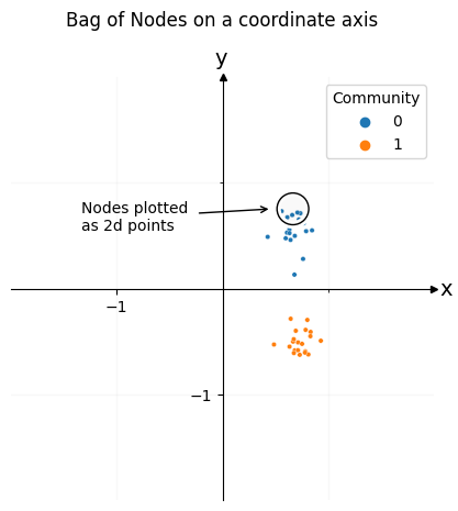
Below you can see the result, colored by community. Each of the dots in this plot is one of the nodes of your network. You can see that the nodes cluster into two groups: one group for the first community, and another group for the second community. Using this representation for the nodes of your network, you can open the door to later downstream machine learning tasks.
from graphbook_code import plot_latents, draw_cartesian, add_circle, text

ax = draw_cartesian(xrange=(-1, 1), yrange=(-1, 1))
plot = plot_latents(embedding, labels=labels, ax=ax)
plot.set_title("Bag of Nodes on a coordinate axis", y=1.1);

# plot circle
x_centroid, y_centroid = embedding[labels==0].mean(axis=0)
add_circle(x_centroid, y_centroid+.2, ax=ax)
ax.annotate("Nodes plotted \nas 2d points", xy=(x_centroid-.2, y_centroid+.2), xytext=(x_centroid-2, y_centroid),
            arrowprops={"arrowstyle": "->"});
3.3.4. Bag of Networks#
The last approach is the bag of networks, which you’d use when you have more than one network that you’re working with. Here, you’d study the networks as a whole and you’d want to test for differences across different networks or classify entire networks into one category or another. You might want to figure out if two networks were drawn from the same probability distribution, or whether you can find a smaller group of nodes that can represent each network, preserving its important properties. This is can be useful if you have extremely large networks, with millions of nodes.
To showcase the bag of networks approach, let’s create a few networks. We’ll have one group of networks distributed the same way, and another group distributed differently. What you want to do is plot each network as a point in space, so that you can see the communities of networks directly.
Both sets of networks will have two communities of nodes, but the first set will have slightly stronger within-community connections than the second. Each network will have 200 nodes in it, 100 for each community.
def make_network(*probs, n=100, return_labels=False):
    pa, pb, pc, pd = probs
    P = np.array([[pa, pb],
                  [pc, pd]])

    return sbm([n, n], P, return_labels=return_labels)

n = 100
p1, p2, p3 = .12, .06, .03

first_group = []
for _ in range(6):
    network = make_network(p1, p3, p3, p1)
    first_group.append(network)

second_group = []
for _ in range(12):
    network = make_network(p2, p3, p3, p2)
    second_group.append(network)
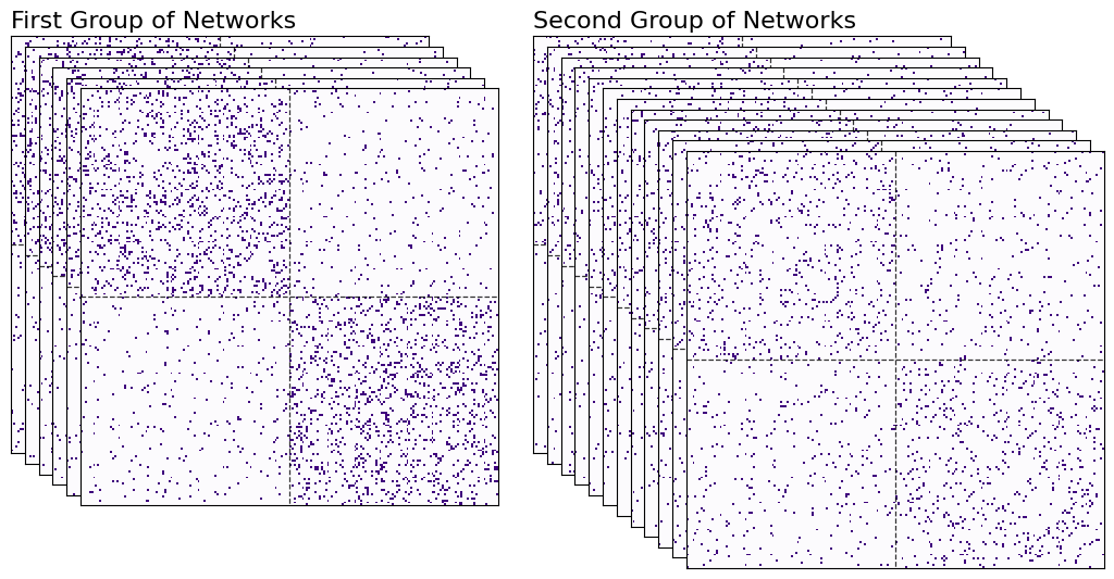
Again, don’t worry too much yet about the process with which these networks were generated - that will all be explained in the next few chapters. All you need to get out of this code is that you have six networks from the first group, and another twelve networks from the second. You can see these networks in heatmap form below.
from graphbook_code import heatmap
import seaborn as sns

fig = plt.figure();

def rm_ticks(ax, x=False, y=False, **kwargs):
    if x is not None:
        ax.axes.xaxis.set_visible(x)
    if y is not None:
        ax.axes.yaxis.set_visible(y)
    sns.despine(ax=ax, **kwargs)

# add stack of heatmaps
for i in range(6):
    ax = fig.add_axes([.02*i, -.02*i, .8, .8])
    ax = heatmap(first_group[i], ax=ax, cbar=False)
    if i == 0:
        ax.set_title("First Group of Networks", loc="left", fontsize=16)
    rm_ticks(ax, top=False, right=False)
    ax.vlines(n, 0, n*2, colors="black", lw=.9, linestyle="dashed", alpha=.8)
    ax.hlines(n, 0, n*2, colors="black", lw=.9, linestyle="dashed", alpha=.8)

# add stack of heatmaps
for i in range(12):
    ax = fig.add_axes([.02*i+.75, -.02*i, .8, .8])
    ax = heatmap(second_group[i], ax=ax, cbar=False)
    if i == 0:
        ax.set_title("Second Group of Networks", loc="left", fontsize=16)
    rm_ticks(ax, top=False, right=False)
    ax.vlines(n, 0, n*2, colors="black", lw=.9, linestyle="dashed", alpha=.8)
    ax.hlines(n, 0, n*2, colors="black", lw=.9, linestyle="dashed", alpha=.8)
Now, you have to figure out some way of plotting each network as a point in space. Here’s a rough overview for how you’ll do it.
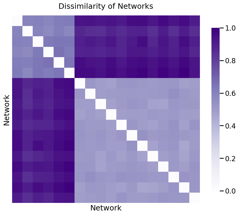
First, you’ll take all of your networks and find a common space that you can orient all of the nodes into. The nodes for all of the networks will exist in the same space, meaning their locations can be compared with each other. We’ll have a bunch of matrices, one for each network. Since each network has 200 nodes, and we’re embedding into 2-dimensional space, we’ll have six 200 by 200 matrices for the first group of networks, and another twelve 200 by 200 matrices for the second group. This process is called finding a network latent space with a homogeneous node latent space, and will be extremely valuable for embedding collections of networks later on.
Now, we’ll look at pairwise dissimilarity for each matrix. The dissimilarity between the \(i_{th}\) and \(j_{th}\) network is defined as the norm of the difference between the \(i_{th}\) matrix and the \(j_{th}\) matrix that we’ve created this way. You can think of this pairwise dissimilarity as just a number that tells you how different the representations for the nodes are between the two networks: a low number means the networks have very similar nodes, and a high number means the networks have very different nodes.
Then, we’ll organize all of these pairwise dissimilarities into a dissimilarity matrix, where the \(i, j_{th}\) entry is the dissimilarity between the \(i_{th}\) and \(j_{th}\) network.
Again, don’t worry if you don’t understand the details: embedding and how it works will be explained in future chapters.
from graspologic.embed import OmnibusEmbed as OMNI
from graspologic.embed import ClassicalMDS

# Find a node latent space for the nodes of all of your networks
omni = OMNI(n_components=2)
omni_embedding = omni.fit_transform(first_group + second_group)

# embed each network representation into a 2-dimensional space
cmds = ClassicalMDS(2)
cmds_embedding = cmds.fit_transform(omni_embedding)

# Find and normalize the dissimilarity matrix
distance_matrix = cmds.dissimilarity_matrix_ / np.max(cmds.dissimilarity_matrix_)
You can see the dissimilarity matrix below, with values between 0 and 1 since you normalized it. As you can see, there are two groups, with the values for two networks in different groups having high dissimilarity, and the values for two networks in the same group having low dissimilarity. The diagonals of the matrix are all 0, because the dissimilarity between a network and itself is 0.
ax = heatmap(distance_matrix, title="Dissimilarity of Networks");
ax.set_xlabel("Network");
ax.set_ylabel("Network");
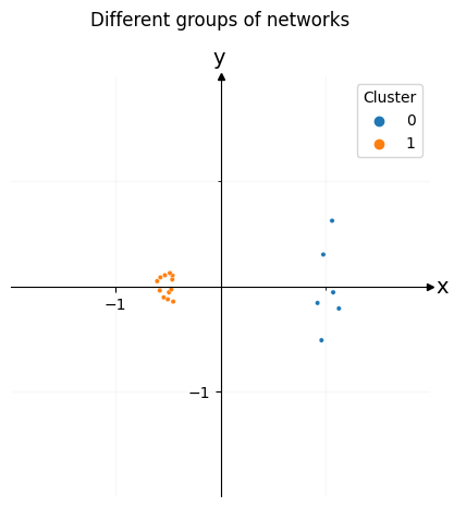
Embedding this new matrix will give us a point in space for each network. Once you find the embedding for this dissimilarity matrix, you can plot each of the networks in space. In the plot below, each network represents a single point in space. We can easily see the two clusters, which represent the two types of networks you created. Since there are six networks of the first type and twelve of the second type, one of the clusters has six dots, and the other has twelve dots.
labels = [0]*6 + [1]*12
ax = draw_cartesian(xrange=(-1, 1), yrange=(-1, 1))
plot = plot_latents(cmds_embedding, ax=ax, labels=labels)
plot.legend_.set_title("Cluster")
plot.set_title("Different groups of networks", y=1.1);
3.3.5. References#
- 1
M. E. J. Newman. Modularity and community structure in networks. Proc. Natl. Acad. Sci. U.S.A., 103(23):8577–8582, June 2006. doi:10.1073/pnas.0601602103.
- 2
Sture Holm. A simple sequentially rejective multiple test procedure. Scandinavian Journal of Statistics, 6(2):65–70, 1979. URL: http://www.jstor.org/stable/4615733 (visited on 2023-02-03).