Community Detection
Contents
6.1. Community Detection#
In Section 5.1 you learned how to estimate the parameters for an SBM via Maximum Likelihood Estimation (MLE). Unfortunately, we have skipped a relatively fundamental problem with SBM parameter estimation. You will notice that everything we have covered about the SBM to date assumes that you the assignments to one of \(K\) possible communities for each node, which is given by the node assignment variable \(z_i\) for each node in the network. Why is this problematic? Well, quite simply, when you are learning about many different networks you might come across, you might not actually observe the communities of each node.
Consider, for instance, the school example you have worked extensively with. In the context of the SBM, it makes sense to guess that two individuals will have a higher chaance of being friends if they attend the same school than if they did not go to the same school. Remember, when you knew what school each student was from and could order the students by school ahead of time, the network looked like this:
from graspologic.simulations import sbm
import numpy as np

ns = [50, 50]  # network with 100 nodes
B = [[0.5, 0.2], [0.2, 0.5]]  # block matrix

# sample a single simple adjacency matrix from SBM(z, B)
A = sbm(n=ns, p=B, directed=False, loops=False)
zs = [1 for i in range(0, 50)] + [2 for i in range(0, 50)]
from graphbook_code import draw_multiplot, cmaps
import matplotlib.pyplot as plt

draw_multiplot(A, labels=zs, title="$SBM_n(z, B)$ Simulation, nodes ordered by school");
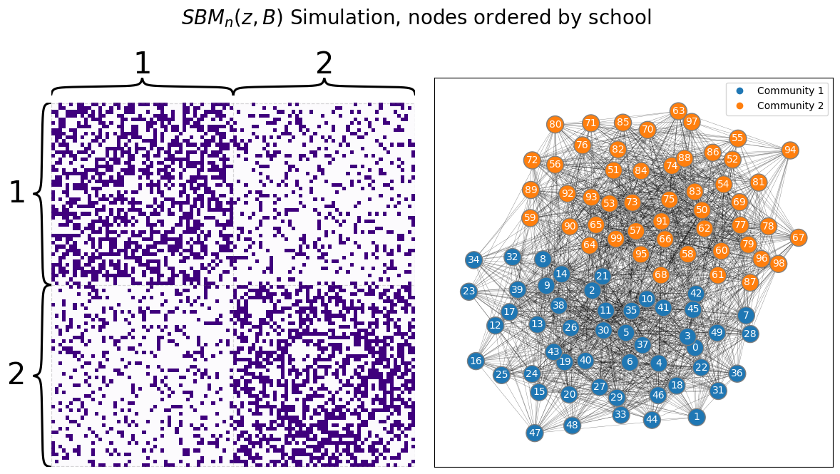
The block structure is completely obvious, and it seems like you could almost just guess which nodes are from which communities by looking at the adjacency matrix (with the proper ordering). Ant therein lies the issue: if you did not know which school each student was from, you would have no way of actually using the technique you described in the preceding chapter to estimate parameters for your SBM. If your nodes were just randomly ordered, you might see something instead like this:
# generate a reordering of the n nodes
vtx_perm = np.random.choice(np.sum(ns), size=np.sum(ns), replace=False)

Aperm = A[tuple([vtx_perm])] [:,vtx_perm]
draw_multiplot(Aperm, title="$SBM_n(z, B)$ Simulation, random node order");
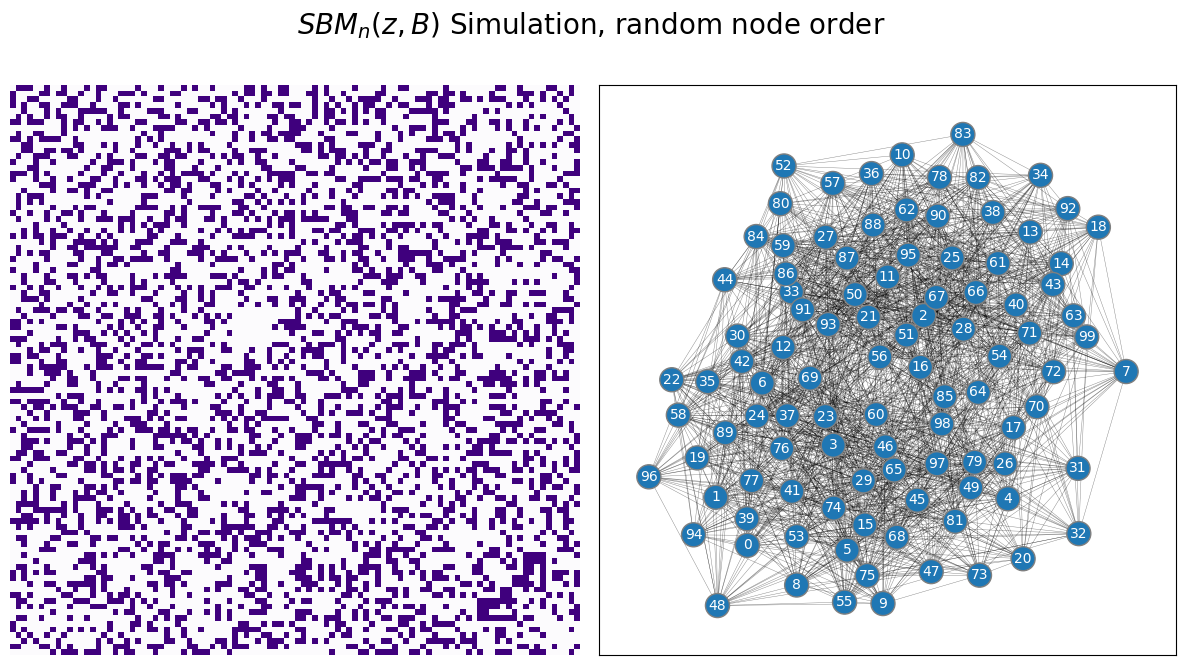
It is extremely unclear which nodes are in which community, because there is no immediate block structure to the network. So, what can you do?
What you will do is use a clever technique we discussed in Section 5.3, called a spectral embedding, to learn not only about each edge, but to learn about each node in relation to all of the other nodes. What do we mean by this? What we mean is that, while looking at a single edge in your network, you only have two possible choices: the edge exists or it does not exist. However, if you instead consider nodes in relation to one another, you can start to deduce patterns about how your nodes might be organized in the community sense. While seeing that two students Bill and Stephanie were friends will not tell us whether Bill and Stephanie were in the same school, if you knew that Bill and Stephanie also shared many other friends (such as Denise, Albert, and Kwan), and those friends also tended to be friends, that piece of information might tell us that they all might happen to be school mates.
The embedding technique you will tend to employ, the spectral embedding, allows you to pick up on these community sorts of tendencies. When we call a set of nodes a community in the context of a network, what we mean is that these nodes are stochastically equivalent. What this means is that this particular group of nodes will tend to have similar other nodes that they are connected to. The spectral embeddings will help us to identify these communities of nodes, and hopefully, when you review the communities of nodes you learn, you will be able to derive some sort of insight as to what, exactly, these communities are. For instance, in your school example, ideally, you might pick up on two communities of nodes, one for each school. The process of learning community assignments for nodes in a network is known as community detection. This problem has been well-established in the network science literature, such as [5], [3], [1], and [4], to name a few.
6.1.1. Stochastic Block Model with unknown communities when you know the number of communities \(K\)#
When you know the number of communities (even if you don’t know which community each node is in), the procedure for fitting a Stochastic Block Model to a network is relatively straightforward. Let’s consider a similar example to the scenario we evaluated in the lead-in to this section, but with \(3\) communities instead of \(2\). You will have a block matrix given by:
Which is a Stochastic block model in which the within-community edge probability is \(0.6\), and exceeds the between-community edge probability of \(0.2\). You will produce a matrix with \(120\) nodes in total.
from graspologic.simulations import sbm

ns = [50, 40, 30]
B = [[0.6, 0.2, 0.2],
     [0.2, 0.6, 0.2],
     [0.2, 0.2, 0.6]]

np.random.seed(1234)
A = sbm(n=ns, p = B)

# the true community labels
z = [0 for i in range(0,ns[0])] + [1 for i in range(0, ns[1])] + [2 for i in range(0, ns[2])]
draw_multiplot(A, labels=z, xticklabels=10, yticklabels=10, title="A, Simulated $SBM_{100}( \\vec z, B)$");
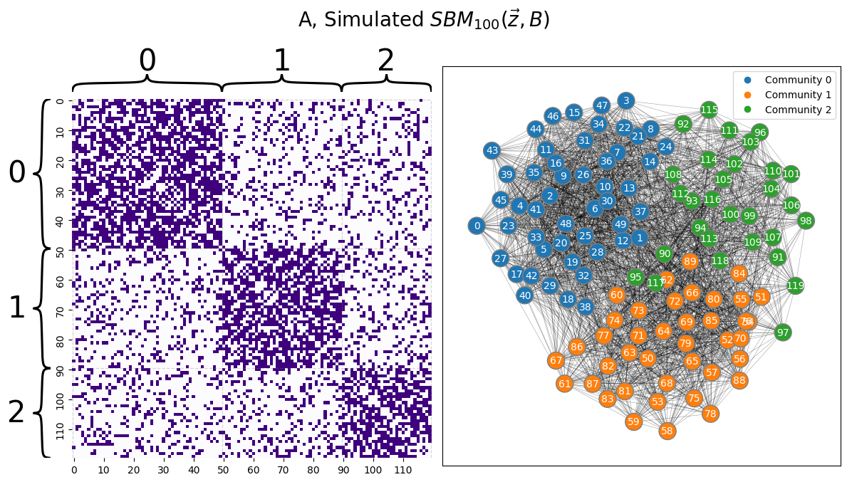
Remember, however, that you do not actually know the community labels of each node in \(A\), so this problem is a little more difficult than it might seem. If you reordered the nodes, the community each node is assigned to would not be as visually obvious as it is here in this example, as you saw in the lead-in to this section.
Your goal here, then, is to determine this hidden, or latent, community assignment vector, so that you can learn things about the SBM that you are studying.
You begin by first embedding \(A\) to estimate a latent position matrix. Remember that to deduce whether there is any latent structure, you take a look at the latent position matrix using a pairplot, like we learned about in Chapter 6. When you know that the number of communities that you are looking for is \(K\), you will embed into that many dimensions. For instance, here we assume that we know that there are \(3\) communities, so we set n_components=3:
from graspologic.embed import AdjacencySpectralEmbed

# adjacency spectral embedding when we look for 3 communities
ase = AdjacencySpectralEmbed(n_components=3)
Xhat = ase.fit_transform(A)
from graspologic.plot import pairplot

_ = pairplot(Xhat, title="Pairplot of embedding of $A$")
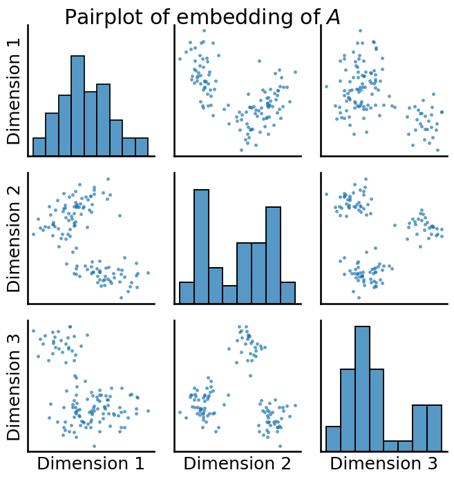
You have some really prominent latent structure here, which is evident from the tightly clustered blobs you have in your pairplot. To see just how well-separated these blobs are, let’s cheat for a second and look at the true labels of each of the points:
_ = pairplot(Xhat, labels=z, title="Pairplot of embedding of $A$", legend_name="Community (Unknown)")
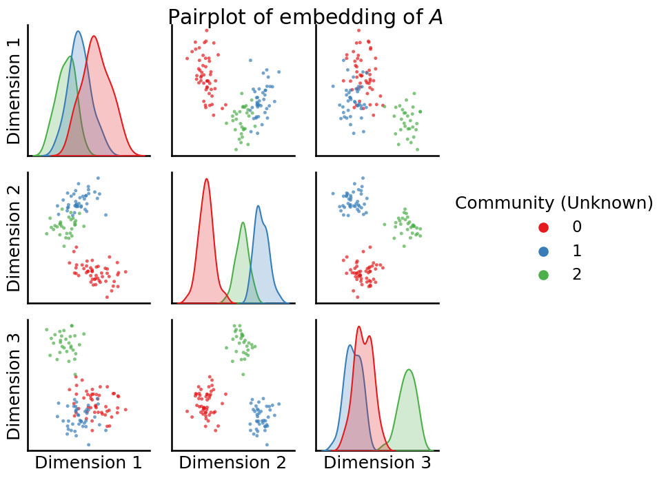
So from what we can see, it’s pretty clear that these extremely tight “blobs” in your dataset correspond exactly to the true community labels of the nodes in your network. So, what you need is a technique which can take a latent position matrix, not know anything about these blobs, and and provide us with a way to learn which points correspond to which blob. For this, we turn to unsupervised learning; particularly the \(k\)-means algorithm.
In this next section, we will assume that you are familiar with several concepts from unsupervised learning, including the \(k\)-means algorithm, the Adjusted Rand Index (ARI), confusion matrices, and the silhouette score. If you aren’t already familiar or want a quick refresher, check out the unsupervised learning basics section of the appendix in Section 13.2, which covers the required background knowledge for these concepts. Briefly, we will use \(k\)-means to estimate the latent community assignment vector, the ARI and confusion matrices to study the homogeneity of the resulting latent community estimates, and the silhouette score to evaluate the latent community estimates.
6.1.1.1. Estimating community assignments via \(k\)-means#
First, we use \(k\)-means to estimate the latent community assignment vector, which we will denote with \(\hat{\vec z}\). The reason that we have the \(\vec\cdot\) symbol is because this is a vector (it has \(n\) elements), and the result we put the \(\hat \cdot\) symbol on top of that is it is also an estimate of the true community assignment vector, \(\vec z\), for the SBM. We can produce the estimate of the community assignment vector using KMeans() from sklearn:
import warnings
warnings.filterwarnings("ignore")

import numpy as np
np.random.seed(42)
from sklearn.cluster import KMeans

labels_kmeans = KMeans(n_clusters = 3, random_state=1234).fit_predict(Xhat)
6.1.1.2. Evaluating your clustering#
In this instance, you have your true community labels already known, because this is just a simulation. When you know your true node labels ahead of time, you can do some special evaluations that take advantage of the fact that you have the true labels. The first of these is to study the confusion matrix, which you can produce with sklearn’s confusion_matrix():
from sklearn.metrics import confusion_matrix
# compute the confusion matrix between the true labels z
# and the predicted labels labels_kmeans
cf_matrix = confusion_matrix(z, labels_kmeans)
import seaborn as sns
fig, ax = plt.subplots(1,1, figsize=(6,4))
sns.heatmap(cf_matrix, cmap=cmaps["sequential"], ax=ax)
ax.set_title("Confusion matrix")
ax.set_ylabel("True Label (School)")
ax.set_xlabel("Predicted Label");
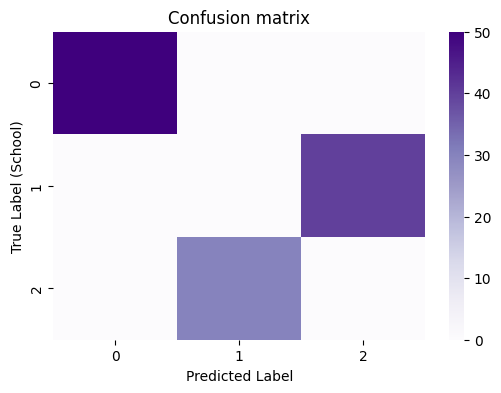
When you have a good clustering that aligns well with your true labels, you will see that the predictions will tend to be homogeneous: a particular true label will correspond to a particular predicted label, and vice-versa. You can evaluate this homogeneity (how well, in general, one true label corresponds to one predicted label, and vice-versa) using the Adjusted Rand Index (ARI), where a score of closer to \(1\) indicates that the true and predicted labels are perfectly homogeneous (one true label corresponds to exactly one predicted label):
from sklearn.metrics import adjusted_rand_score

ari_kmeans = adjusted_rand_score(z, labels_kmeans)
print(ari_kmeans)
1.0
6.1.1.2.1. By remapping the labels, you can evaluate the error rate#
Looking back at the confusion matrix:
fig, ax = plt.subplots(1,1, figsize=(6,4))
sns.heatmap(cf_matrix, cmap=cmaps["sequential"], ax=ax)
ax.set_title("Confusion matrix")
ax.set_ylabel("True Label")
ax.set_xlabel("Predicted Label");

It seems pretty clear that the label correspondance between the true labels and predicted labels is as follows:
Nodes which have a true label of \(0\) correspond to a predicted label of \(0\),
Nodes which have a true label of \(1\) correspond to a predicted label of \(2\),
Nodes which have a true label of \(2\) correspond to a predicted label of \(1\).
This is because all of the nodes which have a true label of \(0\) are assigned a predicted label of \(0\), all of the nodes with a true label of \(1\) are assigned a predicted label of \(2\), and all of the nodes with a true label of \(2\) have a predicted label of \(1\). But when the results aren’t perfect, this is a little bit harder to do, and involves a bit of background in optimization theory, which is outside of the scope of this book. Fortunately, graspologic makes this easy for us, with the remap_labels() function:
from graspologic.utils import remap_labels

labels_kmeans_remap = remap_labels(z, labels_kmeans)
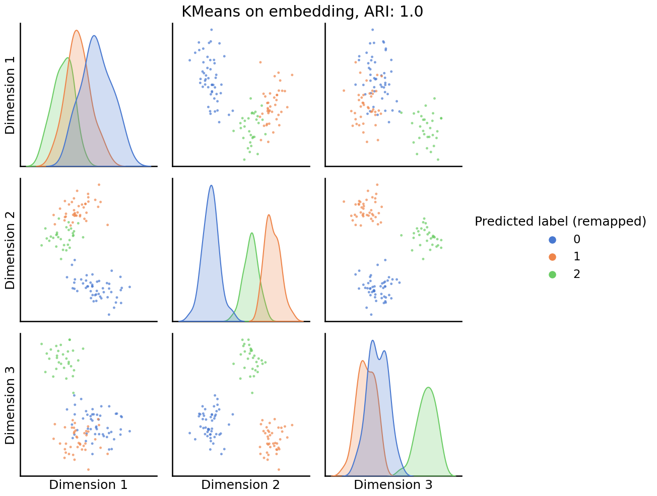
You can use these remapped labels to understand when KMeans is, or is not, producing reasonable labels for your investigation. You begin by first looking at a pairs plot, which now will color the points by their assigned community:
_ = pairplot(Xhat,
         labels=labels_kmeans_remap,
         title=f'KMeans on embedding, ARI: {str(ari_kmeans)[:5]}',
         legend_name='Predicted label (remapped)',
         height=3.5,
         palette='muted',);
The final utility of the pairs plot is that you can investigate which points, if any, the clustering technique is getting wrong. You can do this by looking at the classification error of the nodes to each community:
error = z - labels_kmeans_remap  # compute which assigned labels from labels_kmeans_remap differ from the true labels z
error = error != 0  # if the difference between the community labels is non-zero, an error has occurred
er_rt = np.mean(error)  # error rate is the frequency of making an error

palette = {'Correct Pred.':(0,0.7,0.2),
           'Wrong Pred.':(0.8,0.1,0.1)}

error_label = np.array(len(z)*['Correct Pred.'])  # initialize numpy array for each node
error_label[error] = 'Wrong Pred.'  # add label 'Wrong' for each error that is made
pairplot(Xhat,
         labels=error_label,
         title='Error from KMeans, Error rate: {:.3f}'.format(er_rt),
         legend_name='Error label',
         height=3.5,
         palette=palette,);
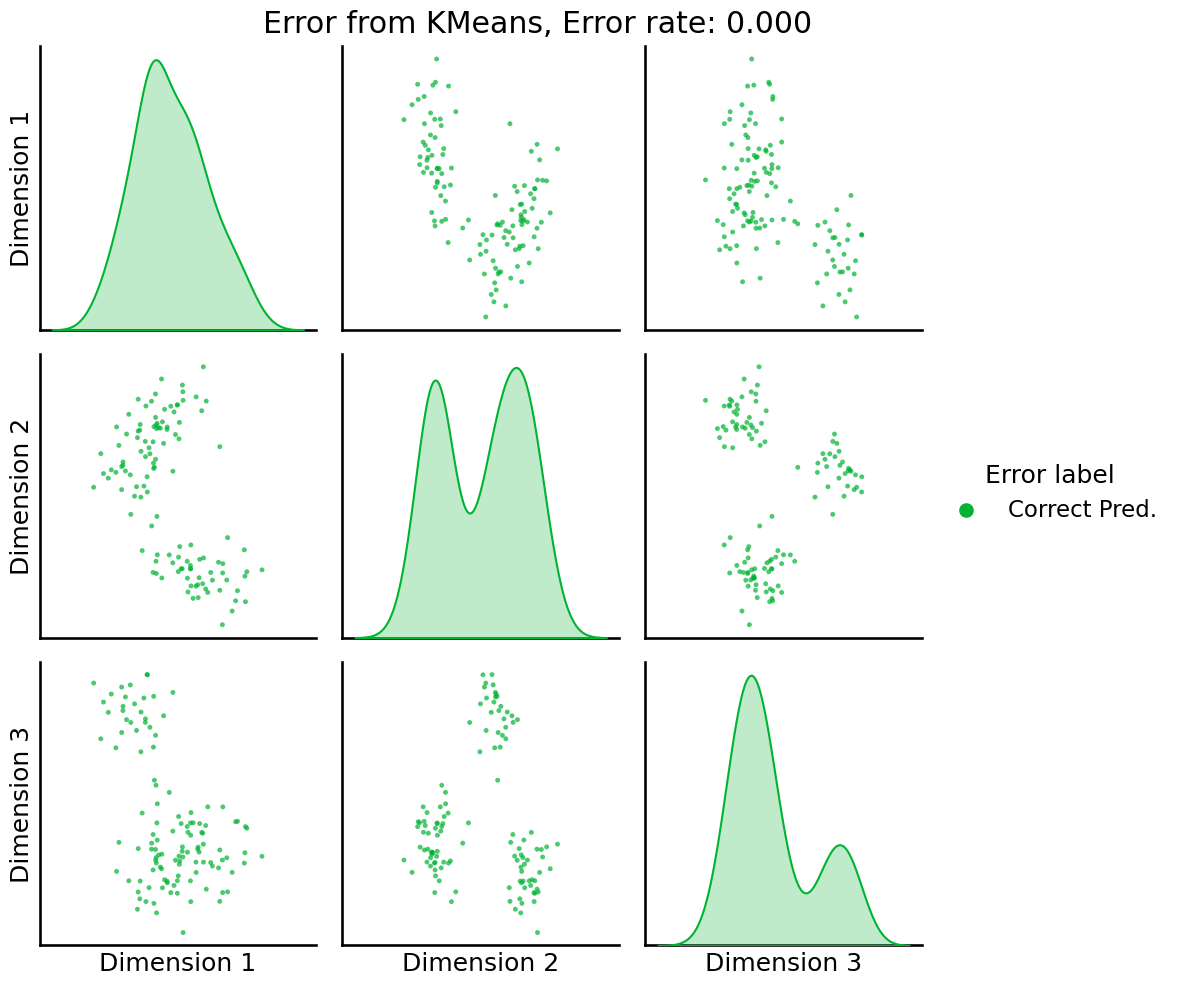
Great! Our classification has not made any errors.
To learn about the block matrix \(B\), you can now use the SBMEstimator class, with your predicted labels:
from graspologic.models import SBMEstimator

model = SBMEstimator(directed=False, loops=False)
model.fit(A, y=labels_kmeans_remap)
Bhat = model.block_p_
from graphbook_code import heatmap

fig, axs = plt.subplots(1, 3, figsize=(18, 6))

mtxs = [Bhat, np.array(B), np.abs(Bhat - np.array(B))]
titles = ["True $B_{SBM}$", " Prediction $\hat B_{SBM}$", "$|\hat B_{SBM} - B_{SBM}|$"]

for i, ax in enumerate(axs.flat):
    heatmap(mtxs[i],
            vmin=0,
            vmax=1,
            font_scale=1.5,
            title=titles[i],
            ax=ax)
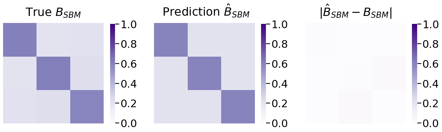
Which appears to be relatively close to the true block matrix.
Recap of inference for Stochastic Block Model with known number of communities
You learned that the adjacency spectral embedding is a key algorithm for making sense of networks which are realizations of SBM random networks. The estimates of latent positions produced by ASE are critical for learning community assignments.
You learned that unsuperised learning (such as K-means) allows us to ues the estimated latent positions to learn community assignments for each node in your network.
You can use
remap_labelsto align predicted labels with true labels, if true labels are known. This is useful for benchmarking techniques on networks with known community labels.You evaluate the quality of unsupervised learning by plotting the predicted node labels and (if you know the true labels) the errorfully classified nodes. The ARI and the error rate summarize how effective your unsupervised learning techniques performed.
6.1.2. Number of communities \(K\) is not known#
In real data, you almost never have the beautiful canonical modular structure obvious to yourom a Stochastic Block Model. This means that it is extremely infrequently going to be the case that you know exactly how you should set the number of communities, \(K\), ahead of time.
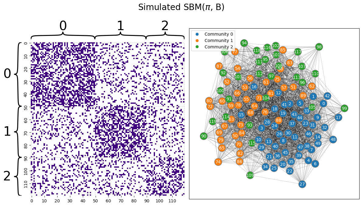
Let’s first remember back to the single network models section, when you took a Stochastic block model with obvious community structure, and let’s see what happens when you just move the nodes of the adjacency matrix around. You begin with a similar adjacency matrix to \(A\) given above, for the \(3\)-community SBM example, but with the within and between-community edge probabilities a bit closer together so that you can see what happens when you experience errors. The communities are still quite apparent from the adjaceny matrix:
B = [[0.5, 0.2, 0.2],
     [0.2, 0.5, 0.2],
     [0.2, 0.2, 0.4]]
ns = [50, 40, 30]
np.random.seed(12)
A = sbm(n=ns, p = B)

# the true community labels
z = [0 for i in range(0,ns[0])] + [1 for i in range(0, ns[1])] + [2 for i in range(0, ns[2])]
draw_multiplot(A, labels=z, xticklabels=10, yticklabels=10, title="Simulated SBM($\pi$, B)");
Next, you permute the nodes around to reorder the realized adjacency matrix:
# generate a reordering of the n nodes
vtx_perm = np.random.choice(A.shape[0], size=A.shape[0], replace=False)

A_permuted = A[tuple([vtx_perm])] [:,vtx_perm]
z_perm = np.array(z)[vtx_perm]
from graphbook_code import heatmap as hm_code
from graphbook_code import draw_layout_plot as lp_code

fig, axs = plt.subplots(1, 2, figsize=(12, 6))

# heatmap
hm = hm_code(
    A_permuted,
    ax=axs[0],
    cbar=False,
    color="sequential",
    xticklabels=10,
    yticklabels=10
)

# layout plot
lp_code(A_permuted, ax=axs[1], pos=None, labels=z_perm, node_color="qualitative")
plt.suptitle("Simulated $SBM(\\vec z, B)$, reordered vertices", fontsize=20, y=1.1)

fig;
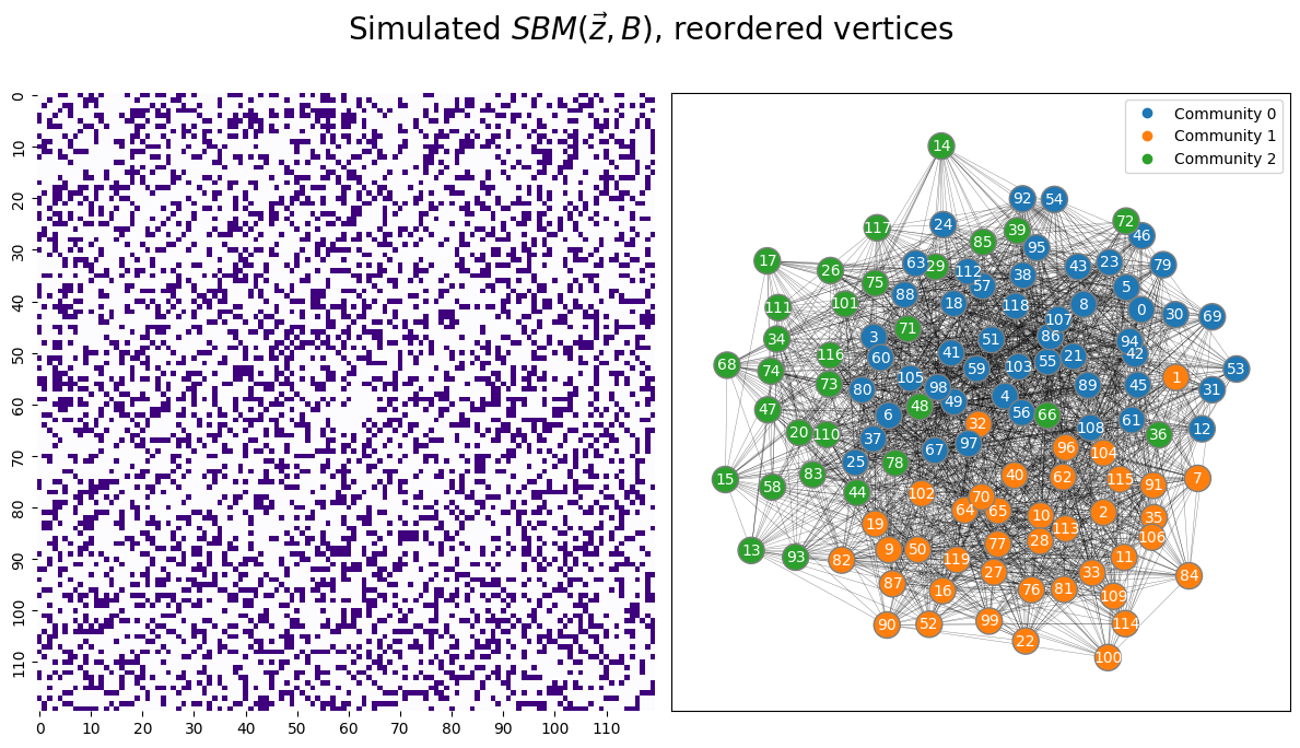
You only get to see the adjacency matrix in the left panel; the panel in the right is constructed by using the true labels (which you do not have!). This means that you proceed for statistical inference about the random network underlying your realized network using only the heatmap you have at left. It is not immediately obvious that this is the realization of a random network which is an SBM with \(3\) communities.
Our procedure is very similar to what you did previously when the number of communities was known. You again embed, but this time since you don’t know the number of communities you are looking for, you using the “elbow picking” technique to select the dimensionality:
ase_perm = AdjacencySpectralEmbed()  # adjacency spectral embedding, with optimal number of latent dimensions selected using elbow picking
Xhat_permuted = ase_perm.fit_transform(A_permuted)
You examine the pairs plot, just like in the section on pairs plots:
_ = pairplot(Xhat_permuted, title="SBM adjacency spectral embedding")
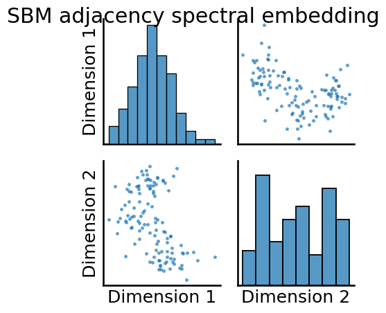
You can still see that there is some level of latent community structure apparent in the pairs plot, as you can see some “blob” separation.
Next, you have the biggest difference with the approach you took previously. Since you do not know the optimal number of clusters \(K\) nor the true community assignments, you must choose an unsupervised clustering technique which allows us to compare clusterings with different choices of cluster counts. Fortunately, this is pretty easy for us to do, too, using a simple statistic known as the silhouette score. If you don’t know what the silhouette score is, you can read about it in the appendix.
6.1.2.1. Using the silhouette score to deduce an appropriate number of communities#
Now that you have the Silhouette score, deducing an appropriate number of communities is pretty easy. You choose a range of clusters that you think might be appropriate for your network. Let’s say, for instance, you think there might be as many as \(10\) clusters in your dataset. You perform a clustering using unsupervised learning for all possible numbers of clusters, from \(2\) all the way up to the maximum number of clusters you think could be reasonable. Then, you compute the silhouette score for this number of clusters. Finally, you choose the number of clusters which has the highest Silhouette score. Let’s see how to do this, using graspologic’s KMeansCluster() function:
from graspologic.cluster import KMeansCluster

km_clust = KMeansCluster(max_clusters = 10, random_state=1234)
km_clust = km_clust.fit(Xhat_permuted);
Next, you visualize the Silhouette Score as a function of the number of clusters:
import seaborn as sns
from pandas import DataFrame as df

nclusters = range(2, 11)  # graspologic nclusters goes from 2 to max_clusters
silhouette = km_clust.silhouette_ # obtain the respective silhouette

ss_df = df({"Number of Clusters": nclusters, "Silhouette Score": silhouette})  # place into pandas dataframe

fig, ax = plt.subplots(1,1,figsize=(12, 6))

sns.lineplot(data=ss_df,ax=ax, x="Number of Clusters", y="Silhouette Score");
ax.set_title("Silhouette Analysis of KMeans Clusterings")
fig;
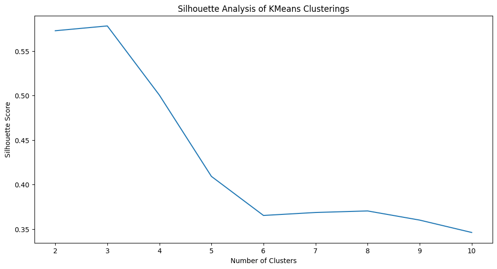
As you can see, Silhouette analysis has indicated the best number of clusters as \(3\) (which, is indeed, correct since we are performing a simulation where we know the right answer). We can get the labels produced by \(k\)-means using automatic number of clusters selection as follows:
labels_autokmeans = km_clust.fit_predict(Xhat_permuted)
As an exercise, you should go through the preceding section on evaluation, and recompute all the diagnostics we did last time for determining whether our predictions were reasonable. You will do this by comparing the true permuted labels z to the predicted labels on the permuted nodes, labels_autokmeans.
6.1.3. Community detection with other types of embeddings#
There are a number of ways to take a network and produce an embedding for a network. We have covered ASE and LSE so far in this book, but in the conclusion of this text, you will learn about a few new ones briefly, including GNNs and node2vec(). These techniques (and many others) can be used, often interchangeably, with ASE as we discussed above to produce similar predicted community assignments for your network, or different depending on the parameters chosen for the embedding technique and the topology of the network.
6.1.4. Community detection with other types of clustering algorithms#
Similarly, there is no restriction to community detection with using \(k\)-means specifically. In fact, for a lot of reasons, the \(k\)-means algorithm might not even be the most sensible approach to go with.
In this next section, we’ll cover a slight augmentation of the SBM, called the Degree-Corrected SBM (DCSBM), wherein nodes are still grouped into communities, but each node can have an augmented node degree. While the block matrix stays similar overall, the individual edge probabilities are:
Where \(\theta_i\) is a scaling factor for the probabilities of student \(i\), and increases (or decreases) the probability that student \(i\) is friends with other students (in general). This can be conceptualized intuitively as the student being more popular, and therefore more likely to be friends with people on accord of their popularity in general.
Let’s take a look at a simulated example:
from graspologic.simulations import rdpg

def ohe(T):
    K = len(np.unique(T))
    ohe_dat = np.zeros((len(T), K))
    for t in np.unique(T):
        ohe_dat[:,t] = (T == t).astype(int)
    return ohe_dat

ns = [50, 100, 60]
# strategy for sampling a DCSBM
theta = np.hstack((np.linspace(1, 1, num=ns[0]), np.linspace(1, 1.2, num=ns[1]), np.linspace(0.8, 1.5, num=ns[2])))
B = [[0.3, 0.25, 0.3], [0.25, 0.6, 0.1], [0.3, 0.1, 0.4]]
z = [0 for i in range(0, ns[0])] + [1 for i in range(0, ns[1])] + [2 for i in range(0, ns[2])]
Z = ohe(z)
U, s, Vt = np.linalg.svd(B)
Bsqrt = U @ np.diag(np.sqrt(s))
X = np.diag(theta) @ Z @ Bsqrt
A = rdpg(X)

P_dcsbm = X @ X.transpose()
A = rdpg(X)
fig, axs = plt.subplots(1, 3, figsize=(15, 6))
ax=sns.scatterplot(x=X[:,0], y=X[:,1], hue=z, ax=axs[0])
ax.legend_.set_title("Community (Unknown)")
ax.set_title("True Latent Positions")
ax.set_xlabel("Latent dimension 1")
ax.set_ylabel("Latent dimension 2")
heatmap(P_dcsbm, vmin=0, vmax=1, inner_hier_labels=z, title="Probability matrix, DCSBM", ax=axs[1])
heatmap(A, vmin=0, vmax=1, inner_hier_labels=z, title="Sample of DCSBM", ax=axs[2]);
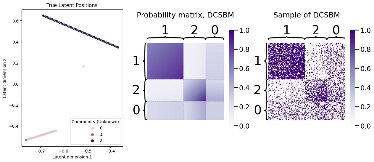
As you can see, the probability matrix is no longer perfectly modular like it would be for an SBM, and in fact, the nodes have an extremely “erratic” looking structure in the probability matrix. However, there is still some fairly clear modularity, which we would hope that our community detection approach might pick up. Let’s see what a spectral embedding looks like for our network sample:
Xhat = AdjacencySpectralEmbed().fit_transform(A)
_ = pairplot(Xhat, labels=z, title="Estimate of latent positions", legend_name="Community (Unknown)")
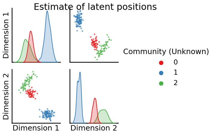
The nodes still look pretty well-separated within-community in the estimates of the latent positions, which is good news since this means our clustering technique should be able to pick this up, right?
The answer is: it depends. Unfortunately, \(k\)-means tends to perform unideal in these situations; that is, when the cluster “shapes” are not totally spherical. You’ll notice, in particular, in the figure above that the clusters look a bit more elliptical in shape than they do like round balls. Let’s take a look at how \(k\)-means does, by performing a \(k\)-means clustering, remapping the labels produced by the clustering, and then looking at the error rate and resulting error pairplot for \(k\)-means:
# predict with k-means
labels_kmeans_erratic = KMeans(n_clusters = 3, random_state=1234).fit_predict(Xhat)
# remap the labels
labels_kmeans_erratic_remap = remap_labels(z, labels_kmeans_erratic)
# compute error rate
error = z - labels_kmeans_erratic_remap  # compute which assigned labels from labels_kmeans_remap differ from the true labels z
error = error != 0  # if the difference between the community labels is non-zero, an error has occurred
er_rt = np.mean(error)  # error rate is the frequency of making an error

palette = {'Correct Pred.':(0,0.7,0.2),
           'Wrong Pred.':(0.8,0.1,0.1)}

error_label = np.array(len(z)*['Correct Pred.'])  # initialize numpy array for each node
error_label[error] = 'Wrong Pred.'  # add label 'Wrong' for each error that is made
_ = pairplot(Xhat,
         labels=error_label,
         title='Error from KMeans, Error rate: {:.3f}'.format(er_rt),
         legend_name='Error label',
         height=3.5,
         palette=palette,);
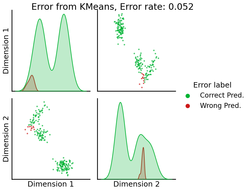
So, \(k\)-means is getting the wrong answer here some times, which might be decent, but let’s see if we can do better.
Next, we’re going to use a slight augmentation of \(k\)-means, called a Gaussian Mixture Model (GMM). Basically, a Gaussian Mixture Model allows you to account for the fact that, in the pairs plot with the true (unknown) community labels, the latent positions for each community tend to be somewhat erratically shaped (they aren’t perfect circles anymore that are all exactly the same size); in this case, they allow for elliptical patterns in the latent positions, or some circles to be smaller (more tightly clustered) than others. When we use sklearn’s GaussianMixture() for clustering, we instead get something like this:
from sklearn.mixture import GaussianMixture
# predict with gmm
labels_gmm_erratic = GaussianMixture(n_components = 3, random_state=1234).fit_predict(Xhat)
# remap the labels
labels_gmm_erratic_remap = remap_labels(z, labels_gmm_erratic)
# compute error rate
error = z - labels_gmm_erratic_remap  # compute which assigned labels from labels_gmm_erratic_remap differ from the true labels z
error = error != 0  # if the difference between the community labels is non-zero, an error has occurred
er_rt = np.mean(error)  # error rate is the frequency of making an error

palette = {'Correct Pred.':(0,0.7,0.2),
           'Wrong Pred.':(0.8,0.1,0.1)}

error_label = np.array(len(z)*['Correct Pred.'])  # initialize numpy array for each node
error_label[error] = 'Wrong Pred.'  # add label 'Wrong' for each error that is made
_ = pairplot(Xhat,
         labels=error_label,
         title='Error from GMM, Error rate: {:.3f}'.format(er_rt),
         legend_name='Error label',
         height=3.5,
         palette=palette,);
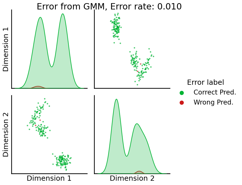
GMM here does a bit better, making a lot fewer errors. For the reason that the GMM tends to work well in the situation where \(k\)-means works great (the nodes within a community are stochastically equivalent), and much better in the situation where \(k\)-means struggles (the nodes within a community are not stochastically equivalent, such as in the DCSBM example), we tend to recommend GMM in practice. For more details on the inner workings of the GMM, check out [5].
6.1.4.1. Choosing number of clusters with GMM#
When you don’t know the number of clusters to use, you can still use the silhouette score; however, with GMM in particular, there is a better approach known as the Bayesian Information Criterion (BIC). If you remember back from your probability or statistics course, the likelihood is the probability of observing the data that you see (in this case, estimated latent positions), given a particular set of parameters (which, in the case of the of the GMM, are the estimated community assignments \(\hat{\vec z}\), the estimated means of the communities \(\hat {\vec \mu}\), and the estimated covariances \(\hat \Sigma_k\) of the communities). The parameters are typically abbreviated with the notation \(\theta\), which is used as a subscript for notational reasons in the statistics community (if you want to know why, check out the appendix section on the probabilistic foundations of network models in Appendix Section 11.3). This quantity is written \(Pr_\theta\left(\hat{\vec x}_1,..., \hat{\vec x}_n\right)\). The log likelihood is simply the log of this, and the negative log likelihood is simply the opposite of that. So, if the probability is high, the negative log likelihood will be low.
The BIC is simply a penalized version of the negative log likelihood, where you penalize the negative log likelihood (make it bigger) when the number of clusters is larger. The BIC is, where \(K\) is the number of communities, \(\hat X\) are the estimated latent positions for the \(n\) nodes, and \(\hat {\vec z}\) are the estimated community assignments for each of the \(n\) nodes:
The BIC penalizes more complicated models (it is higher when the number of clusters is high), so in essence, the BIC is simultaneously balancing having a parsimonious number of clusters (they are enough to give a reasonably high probability and a relatively low negative log likelihood, but not so many that we end up with a really complicated and large model).
To choose the optimal number of clusters with GMM using the BIC, we can use the AutoGMMCluster(). Again, we set max_components to the maximum number of clusters that we think would be reasonable; in this case, \(10\):
from graspologic.cluster.autogmm import AutoGMMCluster

autogmm_clust = AutoGMMCluster(max_components=10, random_state=1234)

labels_autogmm_erratic = autogmm_clust.fit_predict(Xhat)
To compute the “best” clustering, AugoGMMCluster() will automatically estimate GMMs with various numbers of components, parameter choices, and other attributes. The best clusterings are the ones with the lowest BIC, so to compare the BIC across each number of clusters, we should find the minimum BIC for a given number of components:
results = autogmm_clust.results_ # obtain the respective results
# summarize by taking the minimum for each number of clusters
results_summarized = results.groupby("n_components").agg({"bic/aic": "min"})
nclusters = range(2, 11)  # graspologic nclusters goes from 2 to max_clusters

bic_df = df({"Number of Clusters": nclusters, "BIC": results_summarized["bic/aic"]})  # place into pandas dataframe

fig, ax = plt.subplots(1,1,figsize=(12, 6))

sns.lineplot(data=bic_df,ax=ax, x="Number of Clusters", y="BIC");
ax.set_title("BIC Analysis of GMM Clusterings")
fig;
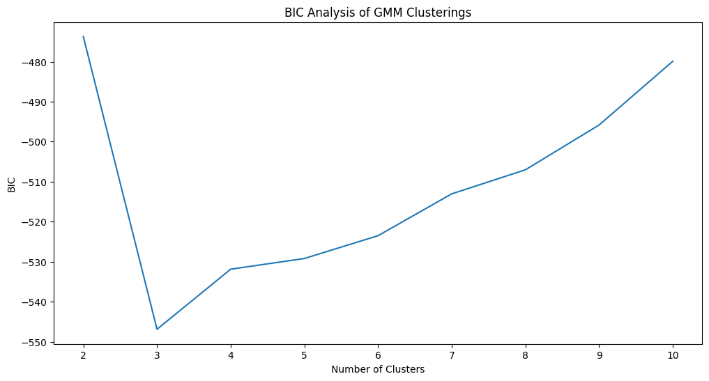
The optimal number of clusters is identified as \(3\), which is correct. Next, let’s take a look at the confusion matrix. We’ll normalize the confusion matrix column-wise, to indicate the portion of points with a given predicted label which correspond to a particular true label:
# compute the confusion matrix between the true labels z
# and the predicted labels labels_kmeans
cf_matrix = confusion_matrix(z, labels_autogmm_erratic)
cfm_norm = np.divide(cf_matrix, cf_matrix.sum(axis=0))
fig, ax = plt.subplots(1,1, figsize=(6,2))
sns.heatmap(cfm_norm, cmap=cmaps["sequential"], ax=ax)
ax.set_title("Normalized confusion matrix")
ax.set_ylabel("True Label (School)")
ax.set_xlabel("Predicted Label");
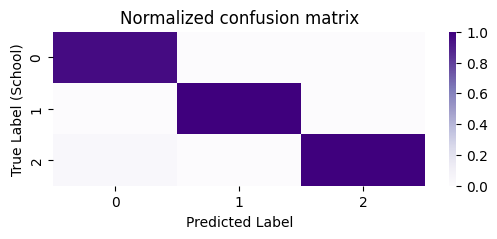
As we can see, for a particular predicted label, almost all of the points correspond to a single unique true label. Stated another way, our clusters are non-overlapping (with respect to the true labels), in that a single predicted label tends to correspond to a single true label.
6.1.5. References#
- 1
Arash A. Amini, Aiyou Chen, Peter J. Bickel, and Elizaveta Levina. Pseudo-likelihood methods for community detection in large sparse networks. arXiv, July 2012. arXiv:1207.2340, doi:10.1214/13-AOS1138.
- 2
M. E. J. Newman. Modularity and community structure in networks. Proc. Natl. Acad. Sci. U.S.A., 103(23):8577–8582, June 2006. doi:10.1073/pnas.0601602103.
- 3
Avanti Athreya, Donniell E. Fishkind, Minh Tang, Carey E. Priebe, Youngser Park, Joshua T. Vogelstein, Keith Levin, Vince Lyzinski, and Yichen Qin. Statistical inference on random dot product graphs: a survey. J. Mach. Learn. Res., 18(1):8393–8484, January 2017. doi:10.5555/3122009.3242083.
- 4
Bisma S. Khan and M. Niazi. Network Community Detection: A Review and Visual Survey. ArXiv, 2017. URL: https://www.semanticscholar.org/paper/Network-Community-Detection%3A-A-Review-and-Visual-Khan-Niazi/2d4e4dc3e46357440c987fc2048f917e196296d0.
- 5
Douglas Reynolds. Gaussian Mixture Models. In Encyclopedia of Biometrics, pages 827–832. Springer, Boston, MA, Boston, MA, USA, July 2015. doi:10.1007/978-1-4899-7488-4_196.