Note
Go to the end to download the full example code.
Quantile prediction intervals with Random Forest Regressor#
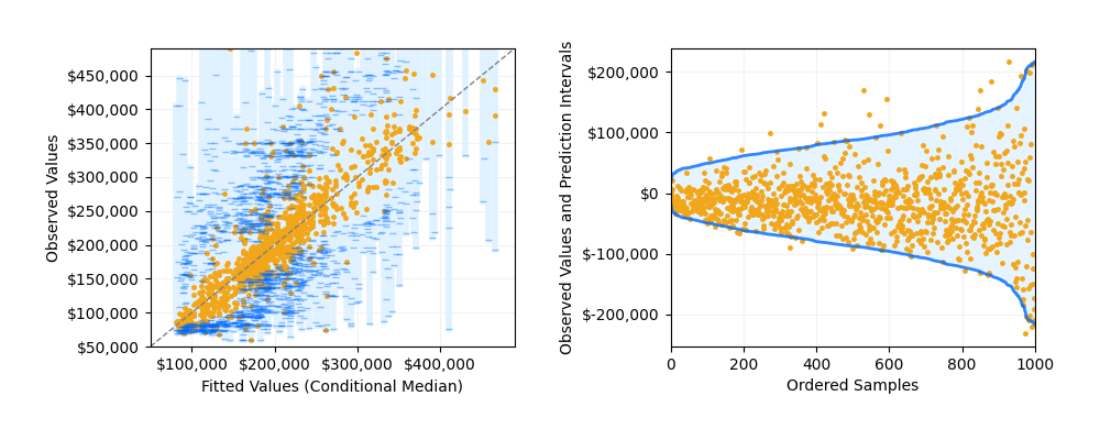
An example of how to generate quantile prediction intervals with Random Forest Regressor class on the California Housing dataset. The plot compares the conditional median with the quantile prediction intervals, i.e. prediction at quantile parameter being 0.025, 0.5 and 0.975. This allows us to generate predictions at 95% intervals with upper and lower bounds.
This example was heavily inspired by quantile-forest package. See their package here.
from collections import defaultdict

import matplotlib.pyplot as plt
import numpy as np
from matplotlib.ticker import FuncFormatter
from sklearn import datasets
from sklearn.ensemble import RandomForestRegressor
from sklearn.model_selection import KFold
from sklearn.utils.validation import check_random_state
Quantile Prediction Function#
The following function is used to generate quantile predictions using the samples
that fall into the same leaf node. We collect the corresponding values for each sample and
use those as the bases for making quantile predictions.
The function takes the following arguments:
1. estimator RandomForestRegressor estimator or any other variations.
2. X_train : training data to be used to train the tree.
3. X_test : testing data to be used to predict the quantiles.
4. y_train : training labels to be used to train the tree and to make quantile predictions.
5. quantiles : list of quantiles to be predicted.
# function to calculate the quantile predictions
def get_quantile_prediction(estimator, X_train, X_test, y_train, quantiles=[0.5]):
    estimator.fit(X_train, y_train)
    # get the leaf nodes that each sample fell into
    leaf_ids = estimator.apply(X_train)
    # create a list of dictionary that maps node to samples that fell into it
    # for each tree
    node_to_indices = []
    for tree in range(leaf_ids.shape[1]):
        d = defaultdict(list)
        for id, leaf in enumerate(leaf_ids[:, tree]):
            d[leaf].append(id)
        node_to_indices.append(d)
    # drop the X_test to the trained tree and
    # get the indices of leaf nodes that fall into it
    leaf_ids_test = estimator.apply(X_test)
    # for each samples, collect the indices of the samples that fell into
    # the same leaf node for each tree
    y_pred_quantile = []
    for sample in range(leaf_ids_test.shape[0]):
        li = [
            node_to_indices[tree][leaf_ids_test[sample][tree]]
            for tree in range(leaf_ids_test.shape[1])
        ]
        # merge the list of indices into one
        idx = [item for sublist in li for item in sublist]
        # get the y_train for each corresponding id``
        y_pred_quantile.append(y_train[idx])
    # get the quatile preditions for each predicted sample
    y_preds = [
        [np.quantile(y_pred_quantile[i], quantile) for i in range(len(y_pred_quantile))]
        for quantile in quantiles
    ]
    return y_preds


rng = check_random_state(0)

dollar_formatter = FuncFormatter(lambda x, p: "$" + format(int(x), ","))
Load the California Housing Prices dataset.
california = datasets.fetch_california_housing()
n_samples = min(california.target.size, 1000)
perm = rng.permutation(n_samples)
X = california.data[perm]
y = california.target[perm]

rf = RandomForestRegressor(n_estimators=100, random_state=0)

kf = KFold(n_splits=5)
kf.get_n_splits(X)

y_true = []
y_pred = []
y_pred_lower = []
y_pred_upper = []

for train_index, test_index in kf.split(X):
    X_train, X_test, y_train, y_test = (
        X[train_index],
        X[test_index],
        y[train_index],
        y[test_index],
    )

    rf.set_params(max_features=X_train.shape[1] // 3)

    # Get predictions at 95% prediction intervals and median.
    y_pred_i = get_quantile_prediction(rf, X_train, X_test, y_train, quantiles=[0.025, 0.5, 0.975])

    y_true = np.concatenate((y_true, y_test))
    y_pred = np.concatenate((y_pred, y_pred_i[1]))
    y_pred_lower = np.concatenate((y_pred_lower, y_pred_i[0]))
    y_pred_upper = np.concatenate((y_pred_upper, y_pred_i[2]))

# Scale data to dollars.
y_true *= 1e5
y_pred *= 1e5
y_pred_lower *= 1e5
y_pred_upper *= 1e5
Plot the results#
Plot the conditional median and prediction intervals. The left plot shows the predicted (conditional median) with the confidence intervals at 95% against the training data. The upper and lower bounds are indicated with the blue lines segments. The right plot shows showed the same prediction sorted by the predicted value and centered at the halfway point between the upper and lower bounds. This allows us to see the distribution of the confidence intervals, which increases as the variance of the predicted value increases.
fig, (ax1, ax2) = plt.subplots(nrows=1, ncols=2, figsize=(10, 4))

y_pred_interval = y_pred_upper - y_pred_lower
sort_idx = np.argsort(y_pred)
y_true = y_true[sort_idx]
y_pred = y_pred[sort_idx]
y_pred_lower = y_pred_lower[sort_idx]
y_pred_upper = y_pred_upper[sort_idx]
y_min = min(np.minimum(y_true, y_pred))
y_max = max(np.maximum(y_true, y_pred))
y_min = float(np.round((y_min / 10000) - 1, 0) * 10000)
y_max = float(np.round((y_max / 10000) - 1, 0) * 10000)

for low, mid, upp in zip(y_pred_lower, y_pred, y_pred_upper):
    ax1.plot([mid, mid], [low, upp], lw=4, c="#e0f2ff")

ax1.plot(y_pred, y_true, c="#f2a619", lw=0, marker=".", ms=5)
ax1.plot(y_pred, y_pred_lower, alpha=0.4, c="#006AFF", lw=0, marker="_", ms=4)
ax1.plot(y_pred, y_pred_upper, alpha=0.4, c="#006AFF", lw=0, marker="_", ms=4)
ax1.plot([y_min, y_max], [y_min, y_max], ls="--", lw=1, c="grey")
ax1.grid(axis="x", color="0.95")
ax1.grid(axis="y", color="0.95")
ax1.xaxis.set_major_formatter(dollar_formatter)
ax1.yaxis.set_major_formatter(dollar_formatter)
ax1.set_xlim(y_min, y_max)
ax1.set_ylim(y_min, y_max)
ax1.set_xlabel("Fitted Values (Conditional Median)")
ax1.set_ylabel("Observed Values")

y_pred_interval = y_pred_upper - y_pred_lower
sort_idx = np.argsort(y_pred_interval)
y_true = y_true[sort_idx]
y_pred_lower = y_pred_lower[sort_idx]
y_pred_upper = y_pred_upper[sort_idx]

# Center data, with the mean of the prediction interval at 0.
mean = (y_pred_lower + y_pred_upper) / 2
y_true -= mean
y_pred_lower -= mean
y_pred_upper -= mean

ax2.plot(y_true, c="#f2a619", lw=0, marker=".", ms=5)
ax2.fill_between(
    np.arange(len(y_pred_upper)),
    y_pred_lower,
    y_pred_upper,
    alpha=0.8,
    color="#e0f2ff",
)
ax2.plot(np.arange(n_samples), y_pred_lower, alpha=0.8, c="#006aff", lw=2)
ax2.plot(np.arange(n_samples), y_pred_upper, alpha=0.8, c="#006aff", lw=2)
ax2.grid(axis="x", color="0.95")
ax2.grid(axis="y", color="0.95")
ax2.yaxis.set_major_formatter(dollar_formatter)
ax2.set_xlim([0, n_samples])
ax2.set_xlabel("Ordered Samples")
ax2.set_ylabel("Observed Values and Prediction Intervals")

plt.subplots_adjust(top=0.15)
fig.tight_layout(pad=3)

plt.show()
Total running time of the script: (0 minutes 4.646 seconds)
Estimated memory usage: 224 MB